Welcome To My Blog
Infographic Wrap-up
Summary
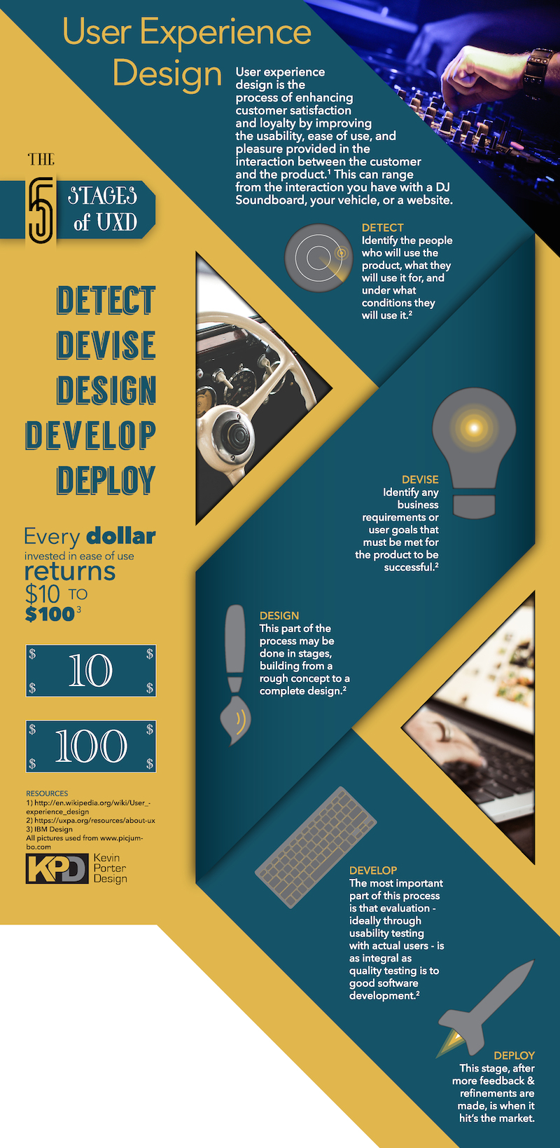
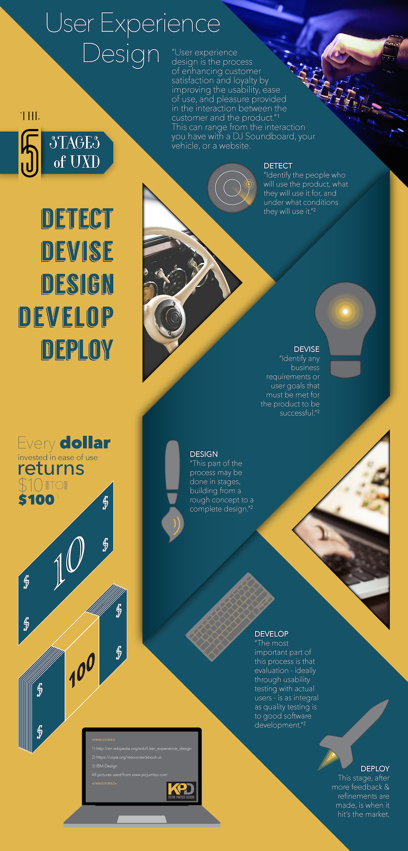
This is the final composition of our work. Our objective was to create an infographic based on a topic we are interested in. It would have to have at least one type of chart in it and at least three vector graphics. The topic I chose was the general process of user experience design, UXD. I chose this because this is a field I am interested in going into, and therefore I wanted to learn a little more about it.
As to problems, I have found that I can’t use very thin text when this file is a jpg. The way I solved this was going through the text again, and making them a regular thickness. It has less heirarchy, but the original is in a pdf, and I think that one is splendid. The program I used was adobe illustrator, because I know how to navigate it pretty easily. I created all the icons, except for the computer and the keyboard.Of which I found manipulated them by cutting out stuff I didn’t want, and altering the color. I also used all the photos from a site called picjumbo, which provides free images.
UXD Infographic Final 2.0
Infographic Final
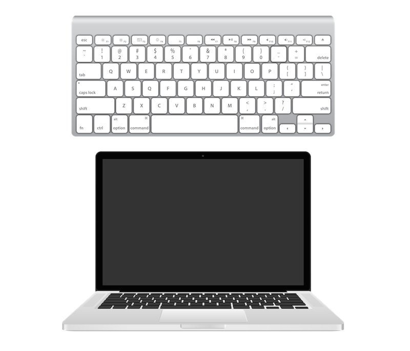
Keyboard Manipulate to icon
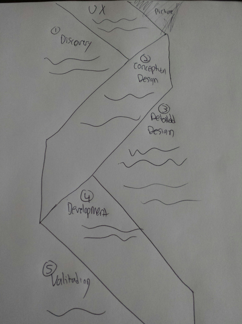
Layout Sketch
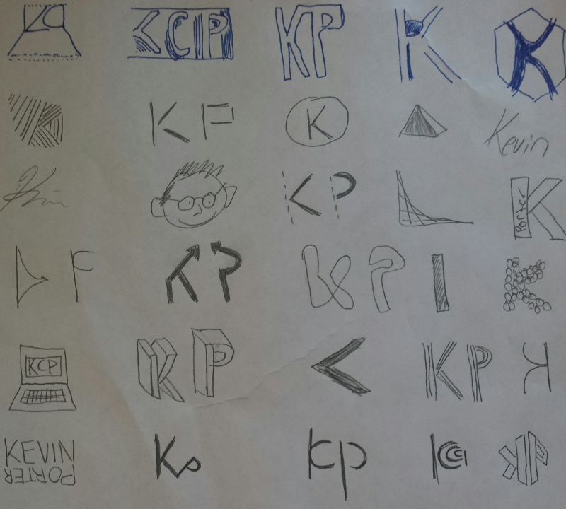
Logo Sketches
http://www.pinterest.com/pin/241435229998524116/
Final Identity
Summary
This project involved designing and developing personal logo, point being to brand ourselves. We achieved this through looking at various designs, sketching our own, vectorizing them with adobe illustrator, and then refining till we got a final product we thought represents us best.
I really enjoyed this project and feel that i still want to go farther with it. I found out about my image to most people, which is what I thought it would be, overall nice and “dapper” personality with a touch of crazy, haha. Now my favorite design is the top one, which I will be using for now. It shows a great color scheme, modern look, and a balanced design, which I think represents me.
All of them represent some aspect of me, with the use of different design principles. Starting from the bottom, the purple is curvy and solid, which is me. The red is sharp and minimalistic, which is me as well. The arrow looking one is sharp as well and has a minimalist feel, and the extras i did were out of curiosity design. Overall great project and yet I know its a never ending one because there is no end to a persons development and identity.
![]()
Second Final Logo Design
Final Board
Self-Portrait
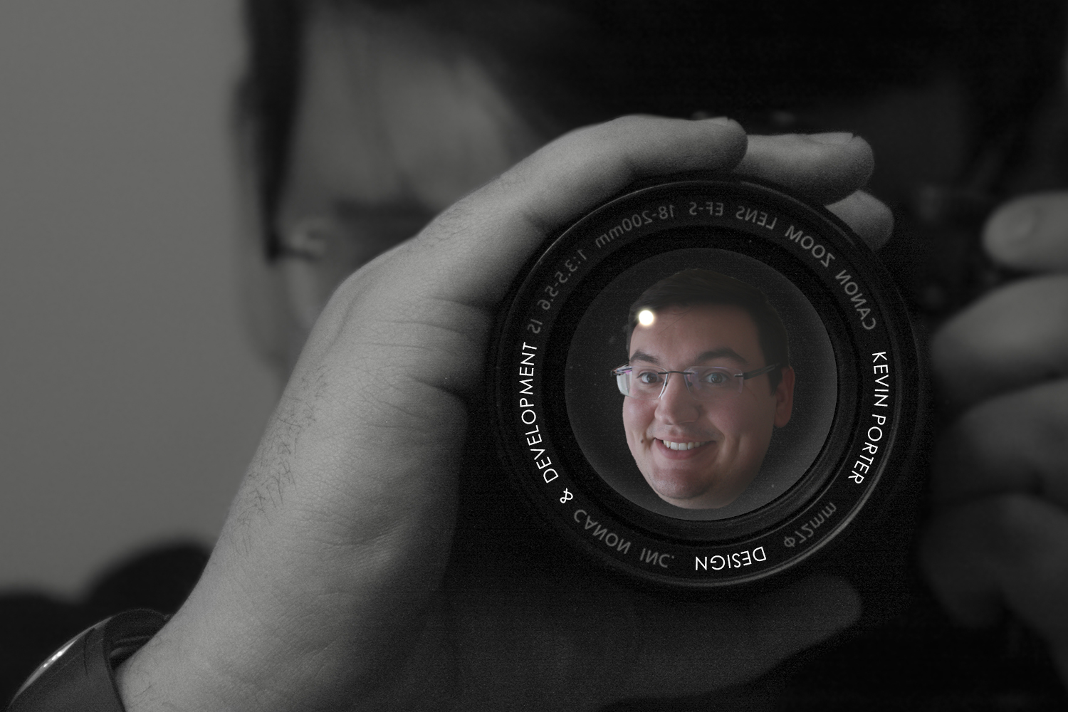
Self Portrait 6-by-4
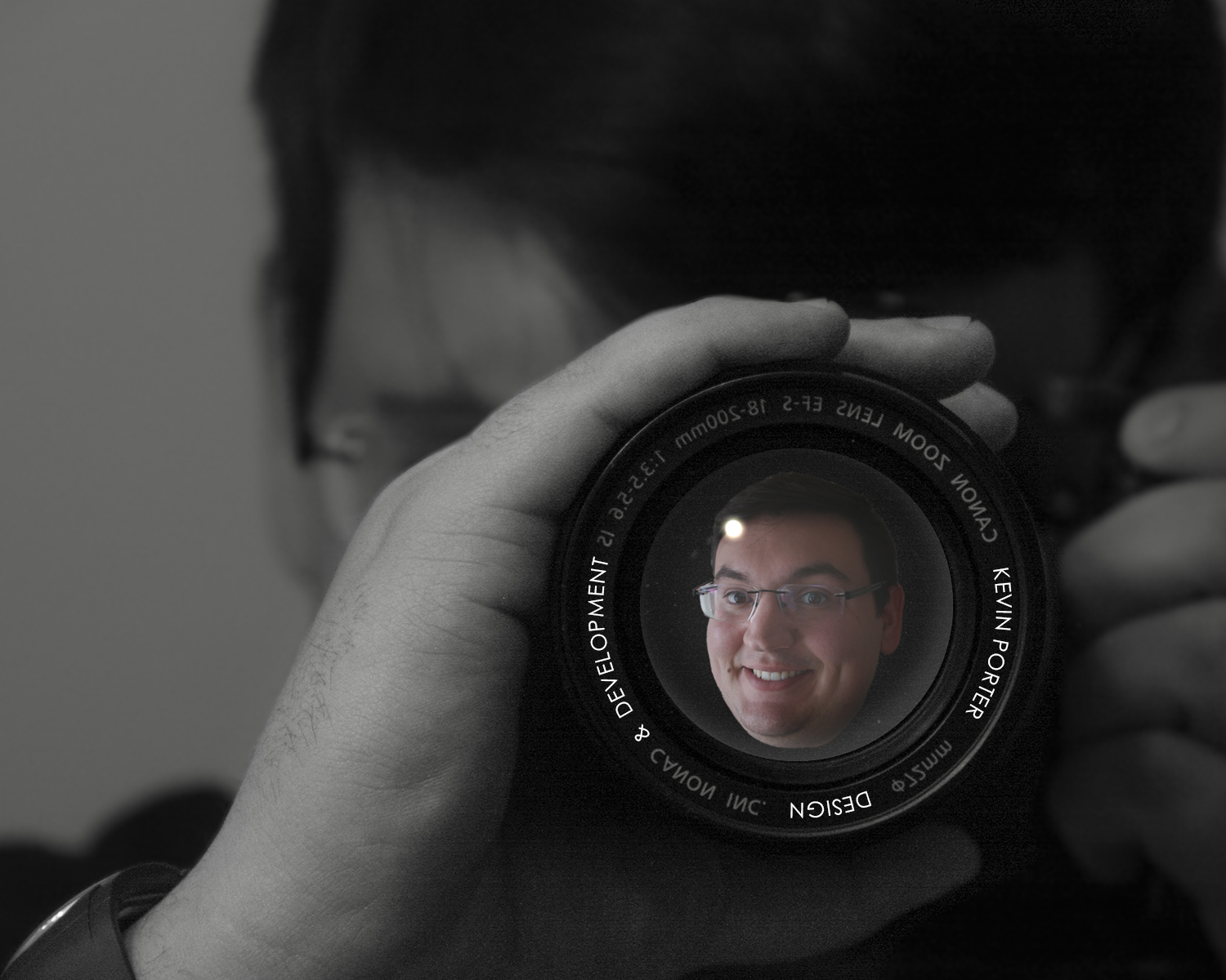
Self Portrait 10-by-8
Project Description
Create a collage in Photoshop: Use two or more digital images to create an 8×10 collage @150 ppi in Photoshop. The dominant image must be a self-taken portrait, but the content for other image(s) is open. The images may be blended with masks, or cropped and arranged in an appealing composition. Some text must be included, but names are optional. Size and save layout for 8×10 and 4×6: Plan the layout so it will also work when cropped to a 4×6. Also, be sure to maintain any borders you may have with the same proportions. DO NOT just crop down your existing layout. Upload and print at a one-hour photo lab: Save and upload properly sized RGB jpegs to an online one-hour photo lab: 8×10 and 4×6 inches @ 150 ppi, Maximum Compression; Optimized Quality. Bring the completed evaluation form with the 4×6 and 8×10 prints to class. Add name and section to the back of prints.
Allow myself to introduce…myself
- Age 0-18: Charlotte, NC (childhood)
- Age 19-20: Sacramento, CA (mission)
- Age 21-24: Provo, UT (self-discovery)
- Age 25-26: Rexburg, ID (BYU-Idaho)
The things that propel at this point in my life: Heavenly Father, Christ, Family, Friends, Designing, Technology, Knowledge, Business, Money, Service, Luxury, Music, Movies, Food, Photography, and of course Women.
Process of Design
I took both these pictures today in my room. I wanted to put my my face in a reflection of a camera lens and so I cut my head out of another picture and then placed it in the lens area. But I wanted it to look more legit so I investigated how to make a “glass look” and read a article about how to make a glass ball, but only did half the tutorial because I just needed a glassy flat lens not a full on sphere. Then I created a circle for wrapped text around it to make it look like the lens’s description but have my name on it and my major.
Expression
This is very simplistic and yet has a lot of depth to it. Which I believe accurately describes who I am. I used a camera theme because that demonstrates art, design, technology, scenery, and capturing beauty. And I believe designs can be capture by producing quality compositions ranging from the way a website looks and functions to just personal journal keeping. And my smile is to indicate that I’m a relatively happy guy.