Overview
Company Profile
Facebook’s mission is to give people the power to share and make the world more open and connected. People use Facebook to stay connected with friends and family, to discover what’s going on in the world, and to share and express what matters to them.
Target Audience
According to Ashley Poland, from Demand Media, “with more than 1 billion users, as of the date of publication — the question becomes who isn’t in the target market on Facebook.” 6 And considering Facebook is “purposefully not built for a special niche or special user base.” 5, we created a target audience according to the statistics: Gender neutral 18 to 29 year old person that has a degree, or is in pursuit of one.
Statistics
- Facebook — the world’s largest social network with 1.19 billion users — remains the most popular in the US, with 71% of US adults using it.
- 63% of people accessing it on a daily basis.
- Nearly 75% of US Internet users who have had at least some education in college use Facebook, according to Pew Research.
- Facebook is one of the social networks purposefully not built for a special niche or a special user base.
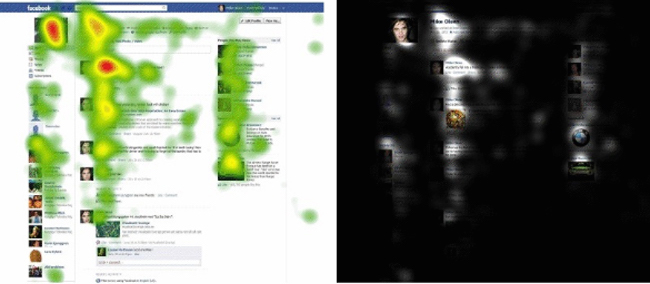
Heatmap Study
“People spend the most time looking at the profile picture and the first two posts on the page. The profile information at the top of the page also ranks high, as does the list of friends on the side. As you move past the halfway mark of the page, visual attention drops significantly. EyeTrackShop also shared a metric called fixation order, which is the order in which most people looked at areas of interest on the page. Interestingly, most people on Facebook started by looking at the middle of the page where status updates are posted, then went to the left panel where friends are listed.” – EyeTrackShop
Interaction Framework
Execution
Goal
Not the Problem, accomplishing the basic goals can be done. But it’s not as aesthetically pleasing.
Intention
Not the problem, a user can easily share, make comments, and discover information.
Specify Sequence
Not the problem, the user can easily click on links and use the top navigation menu to accomplishing tasks. But are their tasks users wish there where there but don’t know because they used it so long?
Execute Sequence
Minor problem, the user can input information and content, but it’s has variations and abilities to your allowance of input on each page. Not very fluid.
Evaluation
Presentation
Problem, the system has the tools, it’s very cluttered compared to its competitors and the user just focuses on two main buttons, being home and profile. Most everything else is ignored. “People use Facebook to stay connected with friends and family, to discover what’s going on in the world, and to share and express what matters to them.” But with the presentation of the site, people seem to just use it to connect and message family and friends, and less with whats going on.
Perception
Not problem, users can understand what the interface is allowing them to do, like posting a comment or looking at photos.
Interpretation
Not the problem, the user can understand and interpret how to navigate the interface.
Evaluation
Not the problem, the user can relate the system information to their interpretation of the interface. However, users are so used to the top bar and system state, that they don’t know or expect more efficient layout and structure.
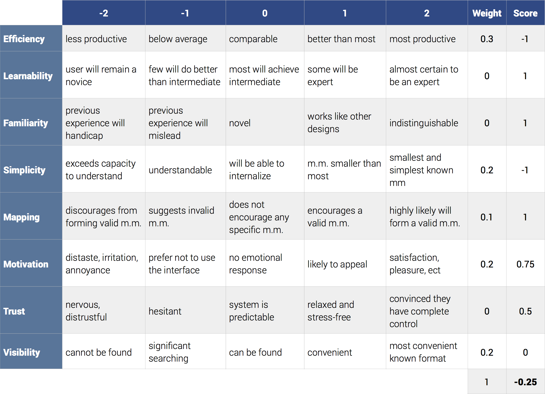
Variables of Usability
Efficiency
The amount of effort or time required to perform a task. -1 — It is easy the scroll through and look at news and profile page, but compared to others, it’s not better.
Learnability
The path to becoming proficient. 1 — Some will be experts.
Familiarity
The degree in which the interface resembles something with which the user has used before. 1 — Works like other design, and most users “grew up” with the design.
Simplicity
The amount the user needs to know to master the system. -1 — Understandable with the navigation bar, but side menus aren’t internalized well.
Mapping
Clues within the design encouraging the user to form a consistent mental model of the system. 1 — encourages a valid mental model, but isn’t consistent.
Motivation
Does the user want to use the system. .75 — system is likely to appeal, but doesn’t provide too much of that emotional response.
Trust
The amount of confidence the user has when using the system. .5 — system is predictable and mostly relaxed.
Visibility
The degree in which the functionality and the data of the system is available to the user when he needs it. 0 — can be found, but not fluid or consistent.
Priority 1
The biggest priority is Efficiency in the interaction and readability of content.
Priority 2
Simplicity, Motivation, and Visibility are the elements involved as a secondary priority.
Priority 3
The last priority is the Mapping of Facebook’s mental model.
System Usability Test
Tasks
Log In Write a post Observer the news feed Comment on one feed Tell us what you like about it the user interface Tell us what you don’t like about the user interface Tell us what you want to see changed Log out
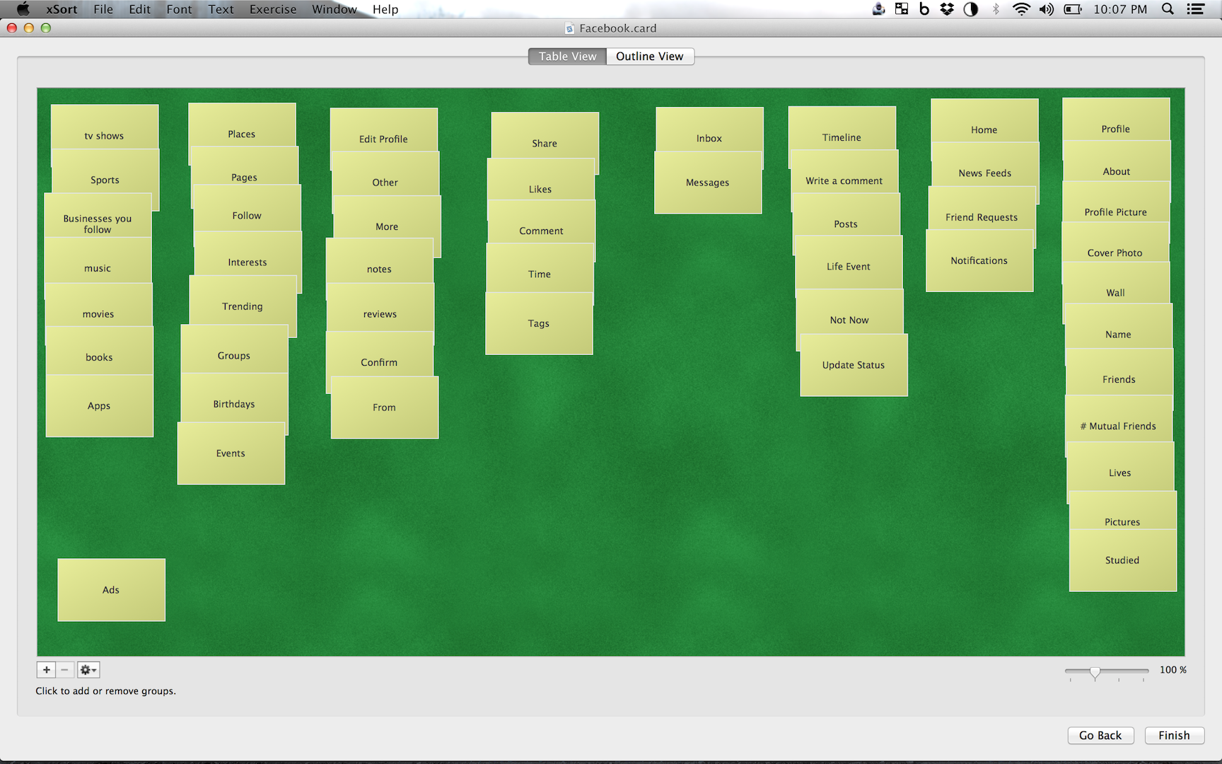
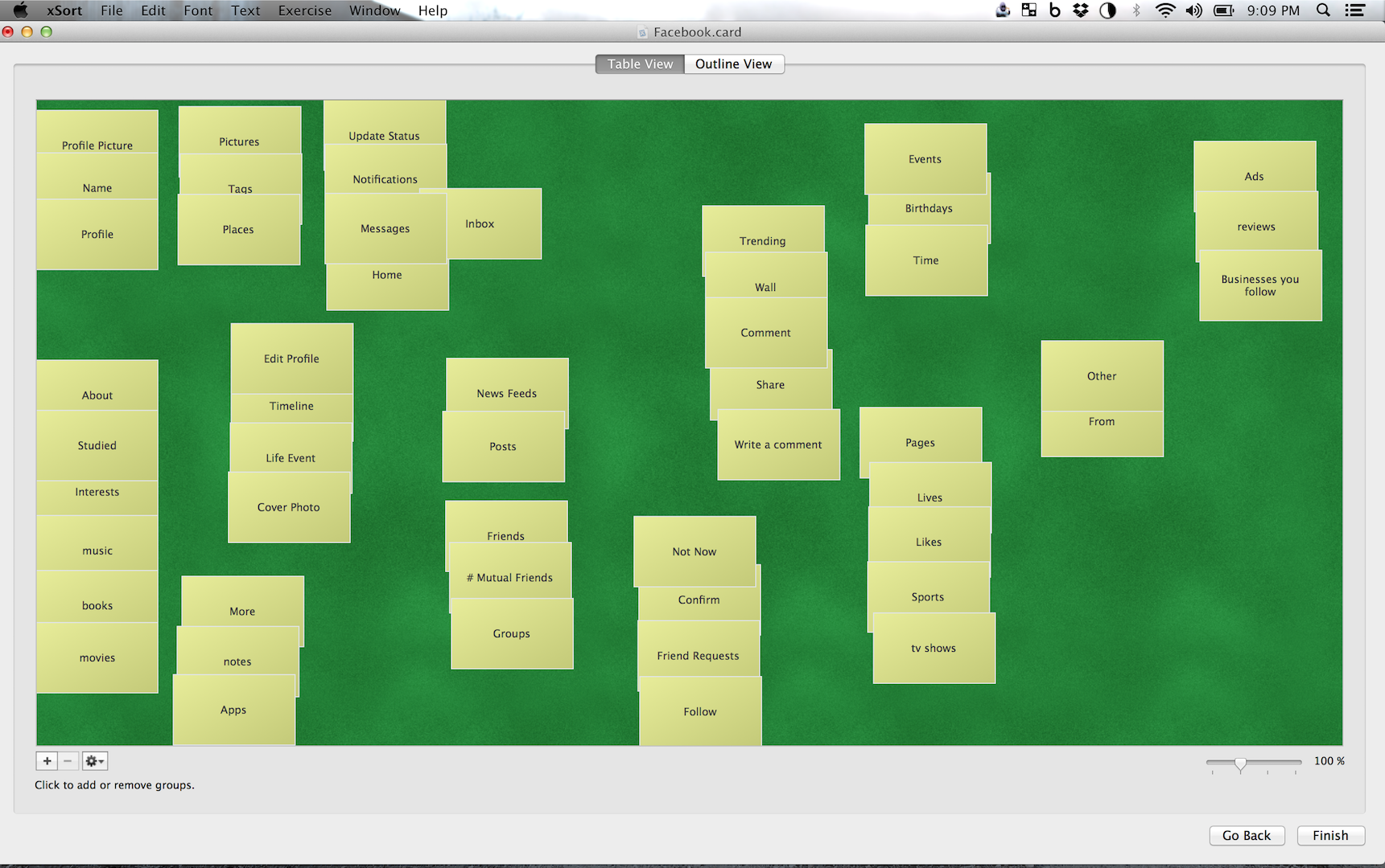
Card Sorting
User Interviews
Participant 1
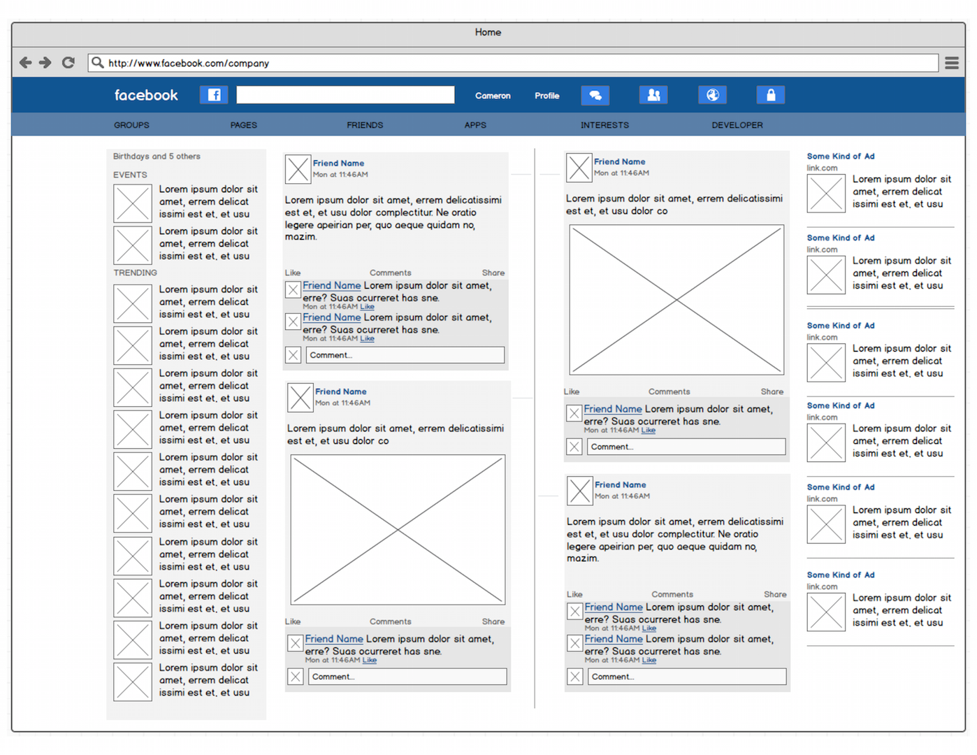
Doesn’t like the timeline method of viewing posts and would rather see it chunked via persons/groups, because she doesn’t like seeing many posts from one individual, group, or followed page. She uses the top navigation bar almost exclusively to navigate the site. Also she doesn’t like the right ChatList window and usually ignores all the content on the left region of the website. Pictures are what grabs her attention when scrolling through the Newsfeed.
Participant 2
Likes the purpose of Facebook, in the aspect keeping in contact with her friends, but doesn’t like seeing the “Suggested Posts” or seeing updates from anything other than her friends. She likes the navigation bar and finds it very useful. Also she usually just looks at pictures as she is scrolling through the Newsfeed, and if it catches her eye, she will read the rest of the content that is with it.
Participant 3
Likes to be informed, therefore he likes how he can see what is trending with the “Trending” container, things that are happening around him with the “Events” container, and seeing people birthdays. He doesn’t like seeing drama, nor posts that seem like they are from his friends, but end up be posts by companies. He likes the timeline, but feels as if he has to stumble upon posts to find certain conversations. He also looks at pictures first, and then the content, but ignores everything on the most left side of the webpage.
Participant 4
Likes the search bar, and the roughly centered design. She wants the ads to be panned off more to the side and wants the ability to get rid of all the content on the left, except for the one group she is in. She usually goes through pictures on the timeline, then if it’s interesting, she will read what that person has to say. She looks at the “Events” panel regularly, but everything below the “Trending” panel is skipped.
Participant 5
Uses groups a lot, but doesn’t like seeing the apps right below it. She also doesn’t like the ChatList panel on the right, because when she need to talk to someone she just uses the Menu Bars Inbox button. The participant doesn’t like the “Recents” panel either because that information will already be in her “Newsfeed”. Doesn’t like the ads, but as for the ads being out of the way, she thinks it’s the best placement. Also if there is no picture, she is unlikely to read content.
Participant 6
Likes the birthday “Events” panel, ChatList sidebar, and content before a picture. However she doesn’t’ like the extra step in getting to the messages area of the webpage, nor does she like having the popup panel for the messages, and would rather just go directly to messages like a email would function. She doesn’t like the content on the very left, nor the “Recents” panel.
Persona
Cameron Buchanan is a 24-year-old student at North Carolina State University, majoring in Business with an emphasis in Marketing. He uses the internet on a daily basis for games, connecting, and learning. Throughout the day, he checks Facebook, for the main purpose of seeing what his friends are up to, then occasionally through out the week, he will share something. When he logs in, he spends 90% of his time scrolling through “Status Updates”, and just scrolls downward till get he sees a picture of something that catches his eye. At that point, he reads what that person has to say and moves downward till he sees more material he enjoys. He automatically skips suggested posts, and ignores everything on the left of the “Status Updates” area. He looks at the birthdays and “Event’s”, to know whats going on, as well as the “Trending” to get in touch with Actual News. Cameron finds it irritating that there is just so much scrolling to see information, as well as seeing unwanted content more often than updates from friends. He likes being informed about the world around him, but not through the method of in which Facebook is now taking. He is very familiar with technology. He uses a iPhone, has a MacBook Pro, and plays video games. The mixture of this technology and using the internet every day gives him the common sense in how to operate a lot of user interfaces. He picks up on the interaction behaviors rather quickly and understands if something is efficient to. If he finds something not easy use, he steers away from it. He isn’t the biggest fan of Facebook, but continues to use it because most of his friends and family use it. Time is very important to Cameron, and desires more content focused on his individual wants and less on the Corporate world. He also wants more visible information about events and trends. Efficiency and Simplicity are the emphasis variables here.

Characteristics
Ages 18-29
Student pursing bachelor’s degree
Technology Attitude likes using the internet
Technology Competency understands it quickly
Goals seeing relevant posts and information
Web Browser Habit uses Facebook daily
Cameron Buchanan
“I don’t want to was’t time looking at nonsense. I just want too see what my friends are up to, the events going on, and news around me.” Cameron is about to graduate and start is own barber shop business.
Age 24
Occupation College Student
Family Married, no children
Income $37,000/year
Technical Profile Really comfortable with technology; Macbook Pro OS X (4 years); Fast Connection; 20-25 hrs/wk online.
Internet Use 80% at home; social, news, and information
Favorite Sites YouTube, Feedly, Twitter
Scenario’s
Scenario 1
Cameron just finished eating breakfast. He wakes up his Macbook Pro, opens Safari, and clicks on the Facebook link in his favorites bar. First, he looks at the “World Icon” to see if he has any new notifications. Noticing he has none, he instantly looks at the “Status Updates” section of the site. He notices a picture that is interesting to him, so he reads the content around it. He enjoyed it so he pressed the like button. Then he started his journey of scrolling through the “News Feed”, continually skipping content with no pictures. He then sees something that seems like a post from a friend, because it doesn’t have a stock photo, and starts reading. Then gets irritated because its a suggested post from a some random company. He slightly shakes his head, then continues to scroll. At this point, he is awaken to the realization again that Facebook is too focused on tricking him, that he scrolls more rapidly while ignoring a lot of content till he see another picture of something interesting. Finally getting to a post from a friend, he enjoys the picture and the written content, that he decides to comment on it. Which is easily done, with the “write a comment…” section within that individual post.
Scenario 2
Cameron is taking a break from school work and decides to see what parties or events are happening around him. He navigates to Facebook, looks at the top right panel and see that in the “Event’s” link, it show that there are 4 events coming up. He clicks it and the a window with the 4 events pop up. At that point the declines 1, maybe’s 2, and joins 1 about a party. He then realizes he has to put that event in his calendar, because Facebook doesn’t provide reminders, nor strong information/notification about the upcoming even. He wished that there was a bigger panel on the right that would show that information constantly in his face to remind him. He then looks right below the events and looks at the “Trending” news. He finds some of the material interesting, clicks “see more”, but only 6 more links pop up to trending stories. He then decides to find out more news from another sources, so he leaves to site and goes to feedly.com where he can find more of what he is looking for. NOTE: From the primary and secondary research I gathered, and considering the users automatic adaption to the system state, as well as the average user doing two main tasks; “scrolling” and “liking”, the best route wasn’t concentrating on “Set Tasks” for the user to accomplish, but to determine a layout and structure that demonstrated an increase in usability and appeal. Eliminating the frustrations the user has with the current experience, being more business focus, and less user focused.
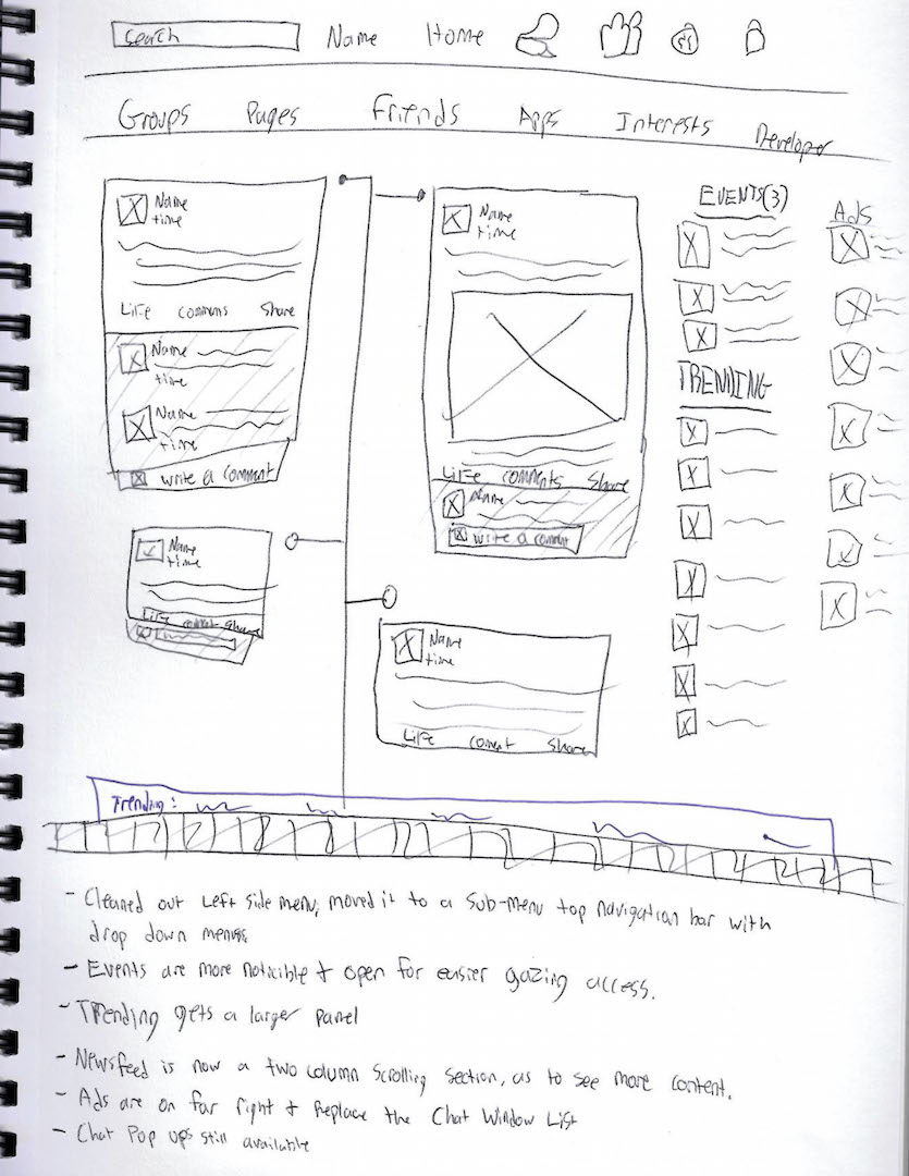
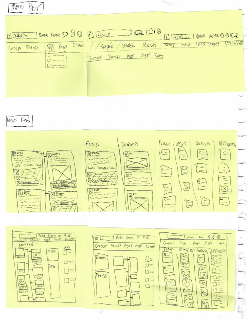
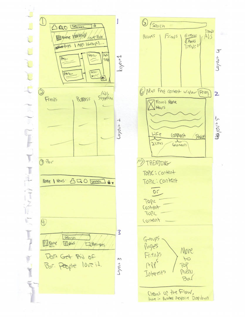
Sketches

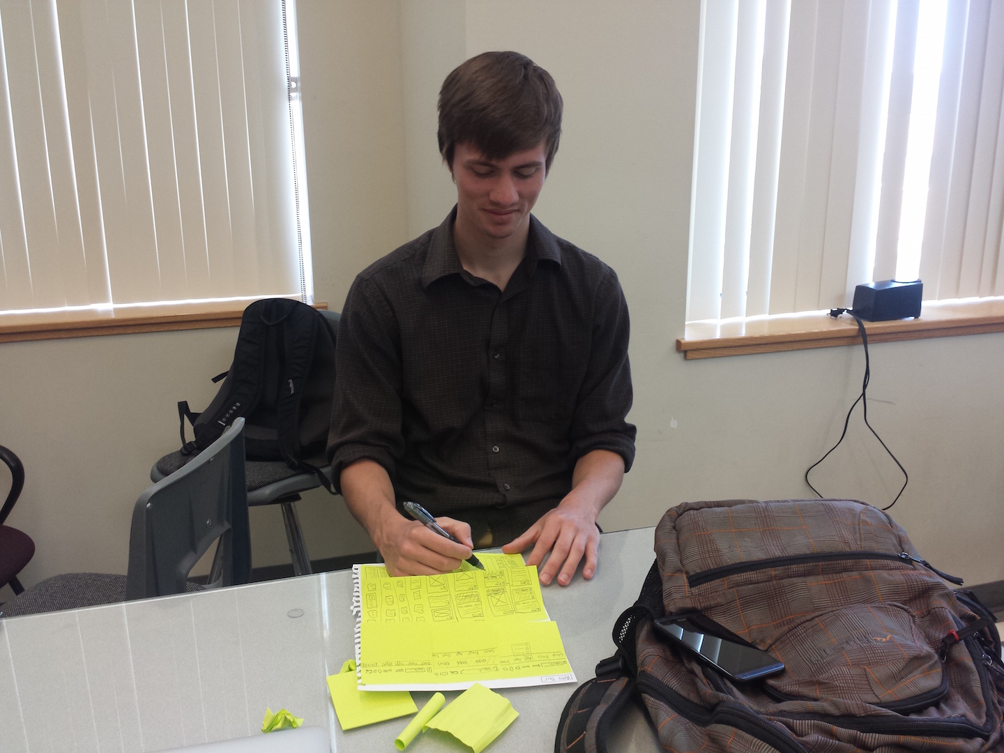

Sketches
On posted notes, I sketched out multiple iterations of layouts, followed by more specific variations of detailed sketches of the Navigation Bar and Newsfeed, which then lead to other iterations of the webpage layout. The sketches were created with the current system state user results in mind.
User Interview Structure
The posted notes were placed on a blank sheet of paper under their appropriate categories. The user was then asked to chose a sketched that demonstrated stronger organization and structure. Their input was then marked under their selected sketch. Then they were asked as to justify the reason behind their selection. Then more detailed sketches were created on drawing paper, and a new set of users were interviewed and tested in the same manner as the Posted Note study.
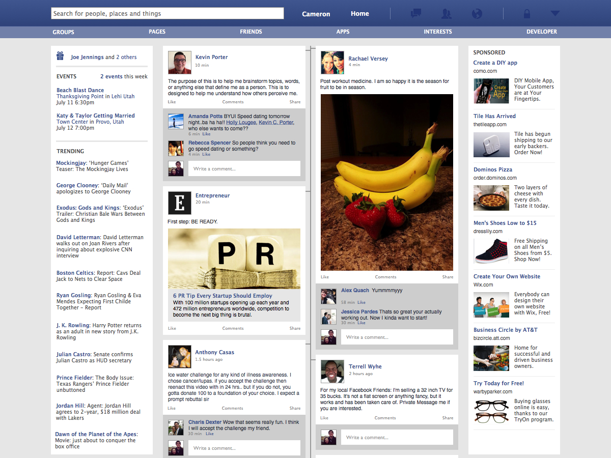
Conclusion
Users loved the two column system “timeline” which allows the user to see twice as much status updates. They also claimed that the sub navigation bar was more logical, as well as having less clutter, than having it being set on the left side.
Wireframes
Wireframes
The wireframes were created in Balsamiq, and formulated from the conclusions of the sketches. These low-fidelity designs gave users the ability to see a little more clearly the layouts that would increase their experience when observing Facebook’s “Newsfeed” page.
User Interview Structure
This was a more of “Thinking Out Loud” method of testing. There was three participants would sit in front of the interface and told me what worked and what didn’t.
Conclusion
All three users ended up telling me they liked “Mock 4” the most becuase centering the main “NewsFeed”, making it more balanced. One of the users also mentioned how they think it’s smart to have the ad’s in relatviely the same spot, so as to keeping to “similar structures”, becuase it’s optized for businesses users as well.
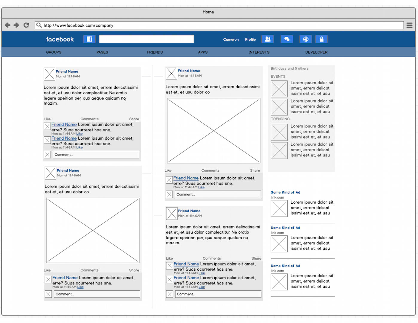
Mock 1
Mock 2

Mock 3
Mock 4
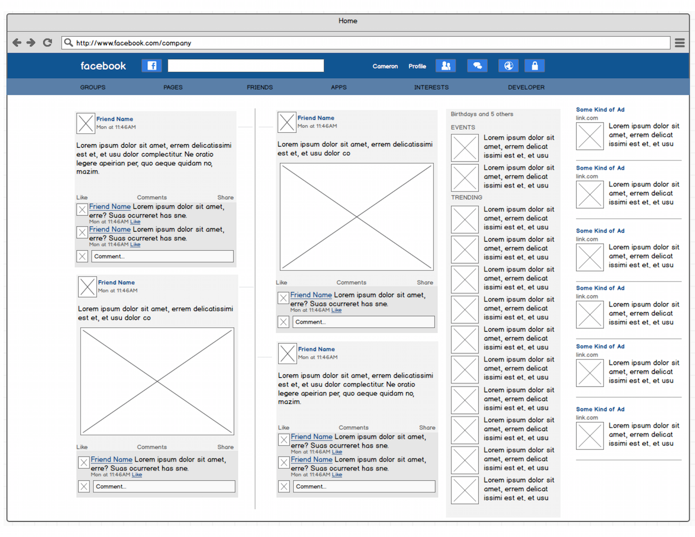
High-Fidelity
High-Fidelity
This hi-fi mock-up was created from Apple’s Keynote Presentation application. Everything was created with that it, except for the four tool bar icons, which was provided by Surgeworks.
Interview Structure
With another set of three participants, they where asked to perform the same tasks required in the “System Usability Test”. This was achieved by taping an area on the screen, as well as “Thinknig Out Loud”.
Conclusion
Each one of them understood the interface rapidly and they enjoyed the layout and struture more than the current system state.