Summary
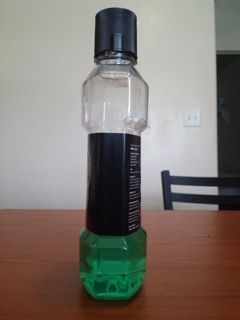
This week was about developing a rough draft of our redesign packaging project. The software I used to create the label was with Adobe Illustrator and Indesign. I used a measuring tap to get the appropriate dimensions for the label placement. I also got a “sharpie” to cover the white top of the glass bottle, which will be done more effectively for the final product.
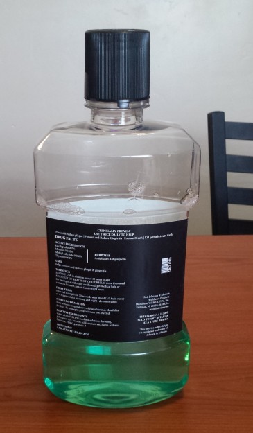
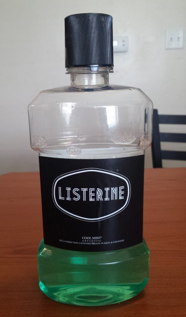
The original container has a separate label on the front and the back. I though it would be great if the container had a label that would go around the whole bottle, portraying a consistent and even appearance. The front is designed to get immediate attraction, and the back was to deliver beautifully flowed “Drug Facts” and information for the customers to read.
Idea
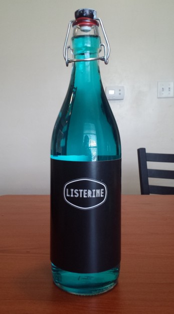
The idea here is to have Listerine continue to use their Trademarked bottled shape, but with a redesign labeling system to gain more appeal and still save the company on production costs. Since their target audience is the flourishing families and traditionalists, adding a new product that is designed to look elegant on your bathroom counter, will help influence the new classy feel to the redesign. The glass bottle is specifically designed to just have the Listerine logo on is, because it can have any “flavor” of Listerine in it.